Remaking an advertisement for a 2€ Hotdog
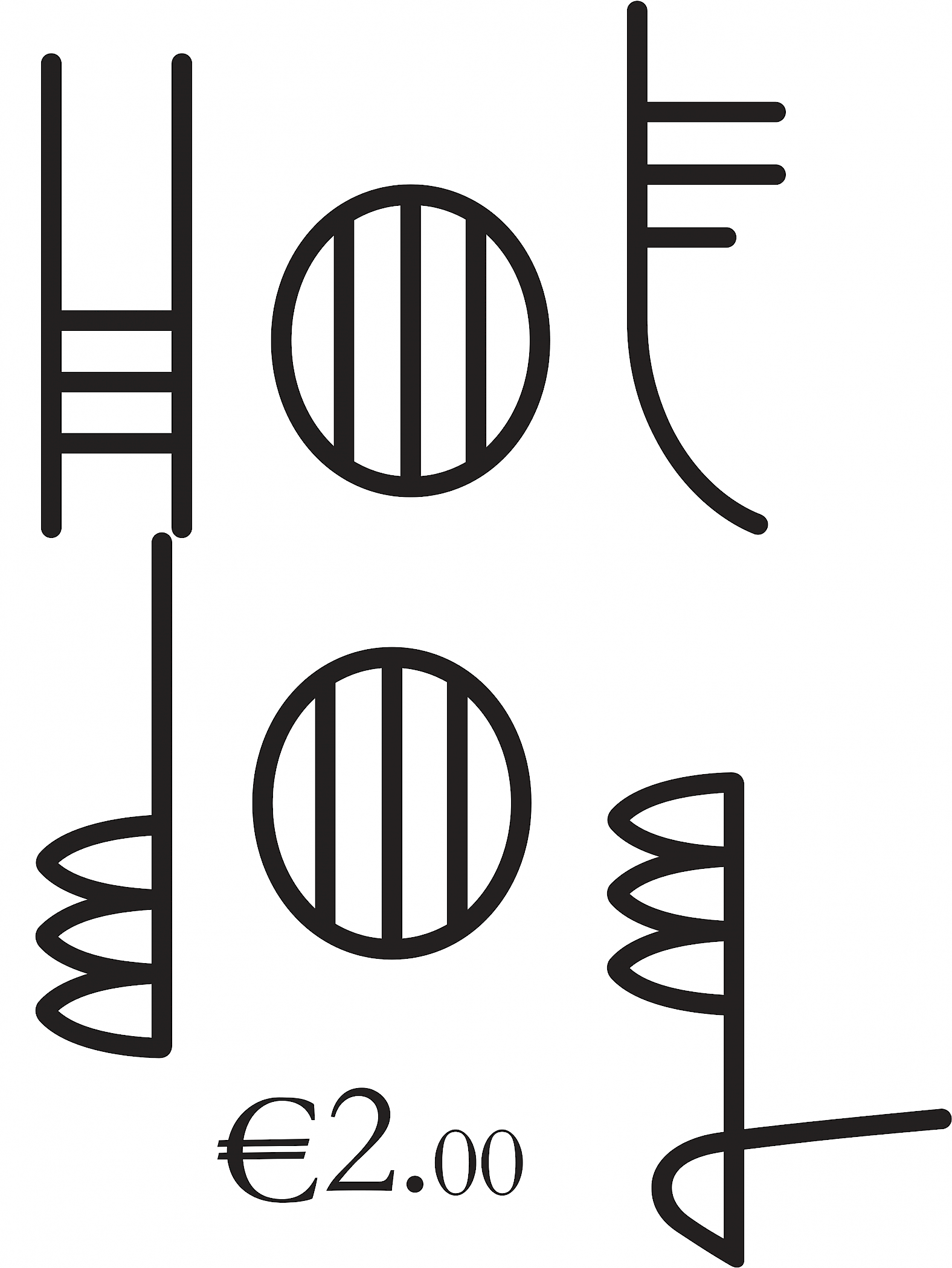
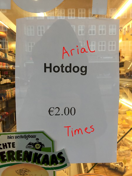
Located at 62 Jan van Evertsenstraat is the ‘Kaaswinkel’. In the window hangs an A4 piece of paper advertising Hotdogs for sale. Repeatedly capturing my attention I even stopped to [surreptitiously] take a photo of it. I like the thing, I like that the person who made it took a few decisions that seemed to set it apart from other A4s in the street, making its layout appealing to me. The type is centred (something I generally avoid doing, but here it seems to work). But the thing I like the most is that it uses two fonts [where one would be enough] – Arial Bold for Hotdog and Times for the price – that are spaced quite far apart, yet contained by the border of the paper. It is a pretty harmonious composition. I showed it to my assistant and he remarked that it was quite a good price for a Hotdog, I immediately thought of the 1€ Hotdogs at IKEA (where I generally avoid going), I’m not really a fan of Hotdogs, they are always a disappointing food for me, like Waffles. I remade this poster as a tribute to the person who made the original, if you are reading this it would be great if you would support the Kaaswinkel by going to buy one. In my version, for Hotdog, I have used a typeface I designed, called ‘Brazil’ – inspired by an eponymous piece of graffiti I saw once in a well known Amsterdam fondue restaurant toilet – which plays with the idea of a not fixed baseline on which the letters normally sit, as well as mixing capital and lowercase letterforms; for the price I used the Unicode system font Songti SC [经典宋体简], which I like because the Latin letterforms follow the design of the Chinese characters, normally with multi-lingual scripts it is the other way around – Western letter design models are incorporated into the other script. Hotdog.
Adriaan Mellegers
03.03.2017
Jop van Bennekom & Wolfgang Tillmans
10.03.2017
Elisabeth Klement
17.03.2017